Adjacent Correlation Analysis: Spatially-aware 2D histograms for data visualization
Let’s walk through how to perform an adjacent correlation analysis using the adjacent_correlation_analysis package. We’ll use example data representing a Turing pattern, specifically the activator (U) and inhibitor (V) concentrations.
Adjacent Correlation Analysis
The adjacent correlation analysis is a method to derive correlation vectors, which can be plotted on top of the density map representing the Probably Density Function (PDF) of the two images data.

Application to MHD Turbulence Simulation Data: This example shows correlation vector fields overlaid on a density map (density PDF). The correlation degree represents the normalized length of the vector, and both the length and orientation are clearly visible in the adjacent correlation plot.

Application to the Lorentz System: Here, vectors derived using adjacent correlation analysis provide a projected view of the vector field in the phase space on the x-y plane, illustrating the system’s dynamic regularities.

Example
### Data Loading and Visualization
First, we need to load our image data. These are 2D NumPy arrays, where each element represents the concentration at a specific spatial location. In this example, we’ll download these arrays, which represent Turing patterns.
import numpy as np
import adjacent_correlation_analysis as aca
import matplotlib.pyplot as plt
from matplotlib.colors import LogNorm # For logarithmic normalization in plots
import wget # To download example data; install with: pip install wget

# Download the activator (U) and inhibitor (V) concentration data
url_u = "https://github.com/gxli/Adjacent-Correlation-Analysis/blob/main/tests/turing_pattern_U.npy"
wget.download(url_u)

url_v = "https://github.com/gxli/Adjacent-Correlation-Analysis/blob/main/tests/turing_pattern_V.npy"
wget.download(url_v)

# Load the data into NumPy arrays
data_u = np.load('./turing_pattern_U.npy')
data_v = np.load('./turing_pattern_V.npy')
Now, let’s visualize these two concentration maps to get a sense of the input data.
plt.figure(figsize=(10, 5)) # Set figure size for better display
plt.subplot(121)
plt.imshow(data_u, cmap='viridis') # Use a colormap for better visualization
plt.title('Activator Concentration (U)') # More descriptive label
plt.colorbar(label='Concentration') # Add colorbar

plt.subplot(122)
plt.imshow(data_v, cmap='magma') # Use a different colormap
plt.title('Inhibitor Concentration (V)') # More descriptive label
plt.colorbar(label='Concentration') # Add colorbar
plt.tight_layout() # Adjust layout to prevent overlap
plt.show()

—
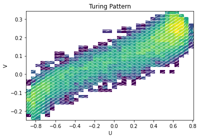
### Method 1: Using adjacent_correlation_plot
The adjacent_correlation_plot function provides a convenient way to directly generate the adjacent correlation plot, overlaying correlation vectors onto the density map in phase space. This method is ideal for quick visualization of the overall correlation structure.
# Generate the adjacent correlation plot
# R is a tuple containing raw correlation data or matrices, depending on the function's internal design.
Ex, Ey, xedges, yedges, R = aca.adjacent_correlation_plot(
    data_u, data_v, bins=35, cmap='viridis', facecolor='w', scale=20, lognorm=True
)

# Customize the plot
ax = plt.gca()
ax.set_xlabel('Activator Concentration (U)') # More descriptive label
ax.set_ylabel('Inhibitor Concentration (V)') # More descriptive label
ax.set_title('Adjacent Correlation Plot for Turing Pattern')
plt.show()
—
### Method 2: Using compute_correlation_vector for Custom Plotting
For more granular control over plotting, you can first compute the correlation vectors using the compute_correlation_vector function. This approach gives you the flexibility to add custom background plots, combine with other visualizations, or analyze the vectors numerically.
plt.figure(figsize=(8, 7)) # Adjust figure size

# First, create the 2D histogram (density map) as a background
h, xedges, yedges, im = plt.hist2d(
    data_u.flatten(), data_v.flatten(), bins=35, norm=LogNorm(), cmap='Greys' # Use LogNorm and a grayscale colormap for background
)
plt.colorbar(label='Density (Log Scale)') # Add colorbar for density

# Compute the correlation vectors
ex, ey = aca.compute_correlation_vector(data_u, data_v, xedges, yedges)

# Prepare the grid for plotting vectors
xx = np.linspace(xedges[0], xedges[-1], len(xedges)-1)
yy = np.linspace(yedges[0], yedges[-1], len(yedges)-1)
x_grid, y_grid = np.meshgrid(xx, yy)

# Plotting the correlation vectors using quiver
plt.quiver(
    x_grid, y_grid, ex.T, ey.T, # Transpose ex, ey for correct orientation if needed by your data
    angles='xy', scale=30, headaxislength=0, # Customize quiver appearance
    color='red' # Set arrow color to red for better visibility against grayscale background
)

plt.xlabel('Activator Concentration (U)') # Add axis labels
plt.ylabel('Inhibitor Concentration (V)')
plt.title('Adjacent Correlation Vectors on Density Map') # Add a title
plt.grid(True, linestyle=':', alpha=0.6) # Add a subtle grid
plt.show()

—
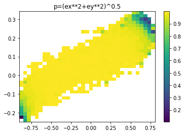
### Visualizing the Correlation Degree ($p$)
The correlation degree $p$ represents the normalized length of the correlation vector, indicating the strength of the local correlation. We can calculate and visualize it as a spatial map, providing insights into where correlations are strongest in the phase space.
The correlation degree $p$ is given by:
where $e_x$ and $e_y$ are the components of the normalized correlation vector.
# Calculate the correlation degree map
p = np.sqrt(ex**2 + ey**2) # Using the ex, ey computed in the previous step

plt.figure(figsize=(8, 6)) # Adjust figure size

# Define the extent for the imshow plot to match the bin edges
myextent = [xedges[0], xedges[-1], yedges[0], yedges[-1]]

plt.imshow(p.T, origin='lower', extent=myextent, aspect='auto', cmap='plasma') # Use a colormap like 'plasma'
plt.title('Correlation Degree Map: $p = \\sqrt{e_x^2 + e_y^2}$') # Use LaTeX for the title
plt.xlabel('Activator Concentration (U)') # Add axis labels
plt.ylabel('Inhibitor Concentration (V)')
plt.colorbar(label='Correlation Degree ($p$)') # Add a colorbar with label
plt.show()