Time Series Example
The adjacent correlation analysis can also be used to construct phase plot using time series
import adjacent_correlation_analysis as aca
import numpy as np
import matplotlib.pyplot as plt
import wget

# load the data
url = "https://github.com/gxli/Adjacent-Correlation-Analysis/blob/main/tests/lorentz_x.npy"
wget.download(url)
url = "https://github.com/gxli/Adjacent-Correlation-Analysis/blob/main/tests/lorentz_y.npy"
wget.download(url)


x = np.load('lorentz_x.npy')
y = np.load('lorentz_y.npy')
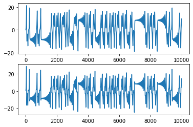
# Plotting the data
plt.subplot(211)
plt.plot(x)
plt.subplot(212)
plt.plot(y)
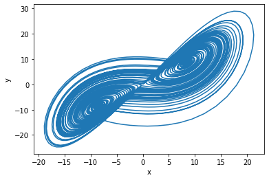
# plotting the data in the phase space
plt.plot(x,y)
plt.xlabel('x')
plt.ylabel('y')
plt.show()
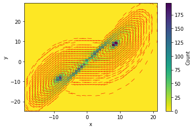
# using the adjacent correlation analysis

aca.adjacent_correlation_plot(x, y,50,cmap='viridis_r',scale=30)
plt.show()