Adjacent Correlation Map: Visualizing Correlations between Quantities
Adjacent Correlation Map
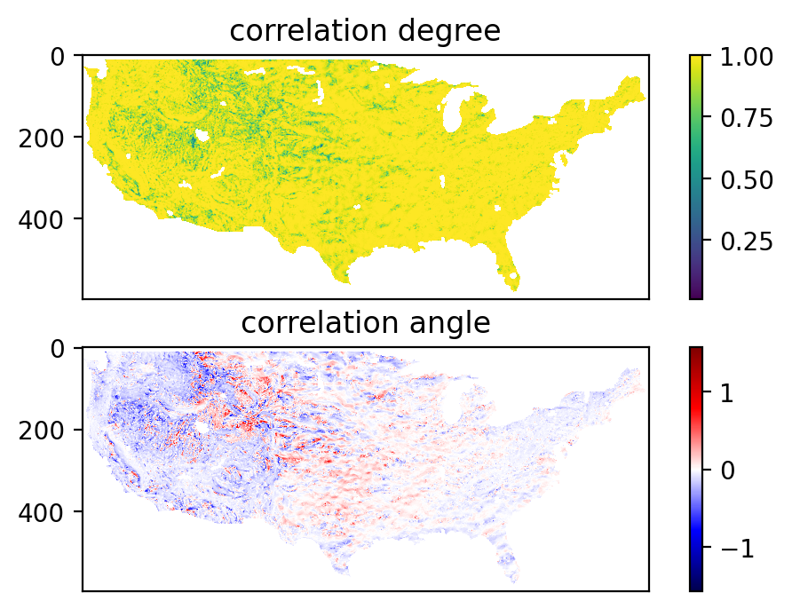
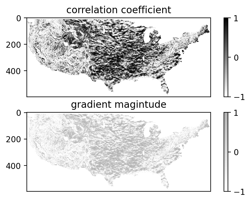
The adjacent correlation map is a method to provide maps of the correlation between the two images. It contains a correlation angle map, a map of the correlation degree, and a correlation coefficient map.

Example
The adjacent correlation map applied to temperature and precipitation data. The output consists of a correlation angle map, a map of the correlation degree, and a correlation coefficient map (available as the program output). The correlation angle map shows the direction of the correlation in the phase space, while the correlation degree map shows the strength of the correlation. Different colors represent different ways temperature T,x and log(percipation) are correlated.
This example shows how to compute and visualize the adjacent correlation map.
import adjacent_correlation_analysis as aca
import numpy as np
import matplotlib.pyplot as plt
Load the data
wget https://github.com/gxli/Adjacent-Correlation-Analysis/blob/main/tests/NOAA_perc.npy
wget https://github.com/gxli/Adjacent-Correlation-Analysis/blob/main/tests/NOAA_temp.npy
data_temp = np.load('./NOAA_temp.npy')
data_perc = np.load('./NOAA_perc.npy')
data_log_perc = np.log10(data_perc)
Plot the data
plt.figure(dpi=100)
plt.subplot(211)
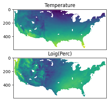
plt.imshow(data_temp)
plt.title('Temperature')
plt.tick_params(axis='x', which='both', bottom=False, top=False, labelbottom=False)
plt.tick_params(axis='y', which='both', bottom=False, top=False, labelbottom=False)
plt.subplot(212)
plt.imshow(data_log_perc)
plt.tick_params(axis='x', which='both', bottom=False, top=False, labelbottom=False)
plt.tick_params(axis='y', which='both', bottom=False, top=False, labelbottom=False)
plt.title('Loig(Perc)')
Text(0.5, 1.0, 'Loig(Perc)')
Compute correlation maps
Compute correlation maps, using compute_correlation_map function:
p, angle, coef, i = aca.compute_correlation_map(data_temp, data_log_perc)
plt.figure(dpi=200)


plt.subplot(211)
plt.imshow(p)
plt.tick_params(axis='x', which='both', bottom=False, top=False, labelbottom=False)
plt.tick_params(axis='y', which='both', bottom=False, top=False, labelbottom=False)
plt.title('correlation degree')
plt.colorbar()

plt.subplot(212)
plt.imshow(angle, cmap='seismic')
plt.tick_params(axis='x', which='both', bottom=False, top=False, labelbottom=False)
plt.tick_params(axis='y', which='both', bottom=False, top=False, labelbottom=False)
plt.title('correlation angle')
plt.colorbar()


plt.figure(dpi=200)


plt.subplot(211)
plt.imshow(coef, cmap='gray_r',alpha=0.5)
plt.tick_params(axis='x', which='both', bottom=False, top=False, labelbottom=False)
plt.tick_params(axis='y', which='both', bottom=False, top=False, labelbottom=False)
plt.title('correlation coefficient')
plt.colorbar()

plt.subplot(212)
plt.imshow(coef,cmap='gray_r',alpha=0.5)
plt.tick_params(axis='x', which='both', bottom=False, top=False, labelbottom=False)
plt.tick_params(axis='y', which='both', bottom=False, top=False, labelbottom=False)
plt.title('gradient magintude')
plt.colorbar()
<matplotlib.colorbar.Colorbar at 0x16acb7dc0>